Welche Farbe ist die richtige?
Every color has its own effect, charisma and statement - and thus its very specific relationship to you. So which color should decorate which room, which wall? This has to be weighed carefully, as colors have a significant influence on our well-being.
Color experiences depend on age, gender, character and mood, as well as on experiences themselves. Fundamental principles can, however, be recognized and proven through experience and scientific tests.
For example, complementary colors are not only a contras in their appearence, the influence on people is also rich in contrast.
Yellow - purple = easy - difficult
Orange - blue = warm - cold
Red - green = stimulating - calming
Purple - yellow - green = serious - cheerful


**Download the the color wheel with the color effects on people**
(from the building biology IBN distance learning course)
Colors that are opposite in the color wheel (complementary colors) should only be combined very carefully, but this is less of a problem with neighboring colors. In the case of using two neighboring colors plus a contrasting complementary color, the complementary color has an invigorating effect.
Black, white and gray are currently modern, especially in conventional building, but they should be used as sparingly as possible, as they are not conducive to our psyche or even our acute well-being. (Just keep in mind expressions like "cruel", "horrible", "gray area" and their respective meanings and think about what is going on when "the cold horror" comes over you). Black, also mixed in all shades with white to gray, is a negative, stressful, cloudy and threatening color. In addition, conventional colors usually have a very low color depth. So if it has to be a gray because of fashion, then stick to ecological colors: Their gray tones, many of which are mixed with a trace of “positive” hues, spread less gloom than the hard, cold fashion gray tones.
The gray tones of the ecological colors are mixed from several complementary colors, creating a colorful and enchanting depth of color (see for example the Conluto Elephant or Ardesia colors, here blue-violet tones set the tone). The blue as a cold, calm and peaceful color combined with the violet, which is characterized by heaviness, loneliness and melancholy, turns gray into a "full" and soulful color through these contrasts.


Neighboring colors usually harmonize very well with one another. Yellowish tones have an enlightening, cozy, radiantly friendly and liberating effect. Therefore, colors such as Sandsteine, Tinaja, Lehmgelb, Lehmocker or Marokkgelb are particularly suitable for the main living rooms, in which we spendplenty of time.


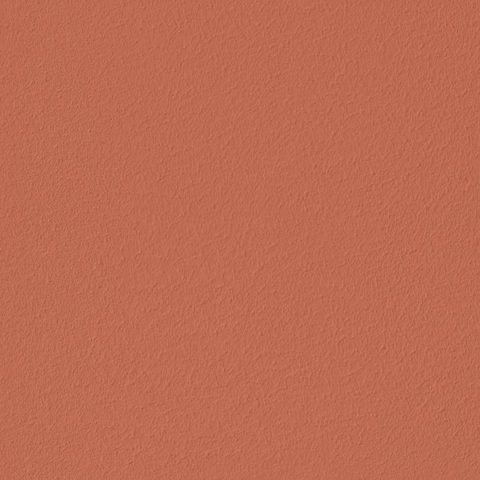
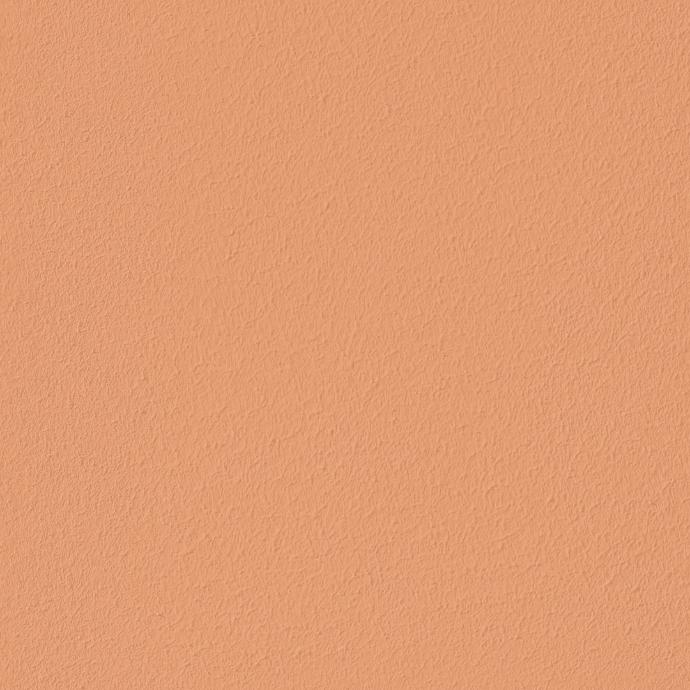
The reddish hues pure or combined, have a strong, stimulating, vitalising effect; if there is a tendency towards orange, heat is added. In the bathroom, where you wake up, we recommend using a reddish shade such as Massada or accents of Lehmrot.


Brownish colors work stabilizing, warm and loyal and convey security. They are ideal for the kitchen, which is often the heart of the house and, as the place where our food is prepared, is already a place of protection and livelihood. We should feel safe here; the shades of Tinaja, Barro tinaja, Massada or Mergel support this.


Weiß ist nicht weiß
Colors are reflections of light waves on objects that absorb different colors and only reflect back the light in the specific wavelength (frequency). This principle is easy to understand with Weiß:White is like light: clear, open and pure. Artificial white, on the other hand, as it predominates in conventional colors, can dazzle, appear uncomfortable and cold. This is due to the composition of the white. The monochrome, single-colored, artificial white tones only vibrate on a very narrow frequency due to the lack of a variety of colors.
Das Farbspektrum der natürlichen Farben ist größer und die Reflexion ist dadurch vielfältiger. Weiße Naturfarben wirken nicht kalt und blendend.
The color spectrum of the natural colors is larger and the reflection is therefore more diverse. White natural colors do not look cold and dazzling.
In addition to color psychology, the respective material properties of each building material influence the end result. Clay paints convey a soft and secure feeling, while a lime paint has a clearer, more direct and solid effect. A silicate paint can even appear hard and aloof, which also corresponds to its physical nature: it is the most stable of all natural colors.

Beratung zur Farbauswahl für den Wohnbereich
Various factors influence the color design of your living space. First there is you. Observe yourself, reflect: in which shades do you feel more or less comfortable? Do you like colors more muted or loud? Earthy, happy, cool, gaudy, factual? Every color should have a positive relationship with the people it surrounds.
Then: the room. As individual as your aesthetic perception, every room is also unique in terms of area, height, proportions, shape, brightness, direction of the compass, the incidence of light and the view from the window.
In order to create a pleasant living environment, there are a few rules of thumb: small rooms should not be painted too dark so as not to create a cramped feeling, and intensive colors should only be used in rooms with short stays, they quickly look exciting. Living spaces, on the other hand, should calm down and contribute to relaxation.
Crass color contrasts often look interesting, but in the long run they can also create chaos and unrest. Decorations and ornaments harmonize with the overall picture of the room if they are kept in similar colors (neighboring colors), but the use of decoration in complementary colors is only recommended for objects that can also be removed non-destructively.
If the building is changeable and rich in shape, the use of different colors should not cause unrest. Straight-lined, clearly shaped and undifferentiated buildings, on the other hand, can stimulate with varied paintwork.
Warm colors such as yellow or orange are preferred to cool colors (green, blue). They create a more comforting atmosphere.
The selection can be simplified at home with color cards and by creating sample areas, whereby the sample areas are optimal, as they include the room, the background and the lighting conditions in the color considerations.
Note: colors on the screen and on printed color cards can sometimes differ greatly from the original color.
Und warum überhaupt natürliche Farben?
Compared to conventional colors, natural colors have many advantages:
-
Low primary energy consumption for production
-
Mostly regional production based on regional raw materials (no crude oil)
-
The room climate effect of clay or lime plaster is retained and promoted: breathable, partly air-purifying, partly pollutant-binding
-
No electrostatic charge (conventional paints contain plastic parts that are stimulated and electrostatically charged by light contact with dust particles from the air - like a balloon that you rub on your hair)
-
Usually easier to touch up
-
No toxic ingredients
-
More pleasant smell
-
Harmonious and lively color effect
-
Stimulating texture
-
Disposal via compost is possible (conventional paints are mostly hazardous waste and building materials painted with conventional paint are then also hazardous waste